UIButton control states
Here’s another example of the (slightly) hidden flexibility of UIButton. Until recently, I was not aware that, in the various setX:forState: methods, you can actually use a bitmask to specify multiple control states. Hopefully I’m not the only person in the world that didn’t realise this and this article will help someone else.
In the documentation for UIControl, control states are described thusly (emphasis mine):
The state of a control; a control can have more than one state at a time. States are recognized differently depending on the control. For example, a UIButton instance may be configured (using the setImage:forState: method) to display one image when it is in its normal state and a different image when it is highlighted.
So why would you care about this? Say you were implementing an edit button or a selection button with text, a background image and an image. You want different text and images for the selected and unselected states (e.g. Edit and Done), but you also want to modify the images or background images when highlighting - if you’re creating your own theme for the app then the default darkening or dimming might not be what you want.
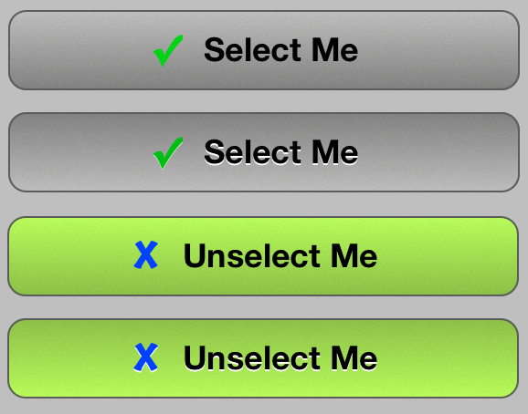
So you actually need four images - normal, highlighted, selected and selected + highlighted.
This is achieved like so:
[self.button setBackgroundImage:normal forState:UIControlStateNormal];
[self.button setBackgroundImage:highlighted forState:UIControlStateHighlighted];
[self.button setBackgroundImage:selected forState:UIControlStateSelected];
[self.button setBackgroundImage:selectedHighlighted forState:UIControlStateSelected | UIControlStateHighlighted];
You can do a similar thing with setImage:forState and setTitle:forState: (you need to specifically set a title for UIControlStateSelected | UIControlStateHighlighted, because otherwise the title for UIControlStateNormal will be used. If you’re using different title text attributes, you also need to specifically set them for the selected + highlighted state.
Here’s a spectacularly ugly demonstration of the four states of a button: